 You wouldn’t show up to a business meeting in a track suit or swim wear, would you? I hope not! Similarly, you wouldn’t own a business with an ineffective or average logo, would you? Well, you’d be surprised how many business owners get this area of their business wrong.
So we asked our friend Leah Bridge from The Golden Goose Design Studio to share some advice on getting your business’ visual identity right:
With so many crowd-sourced ‘logo’ design companies around, it has become far too easy to chop and change your business’ logo.
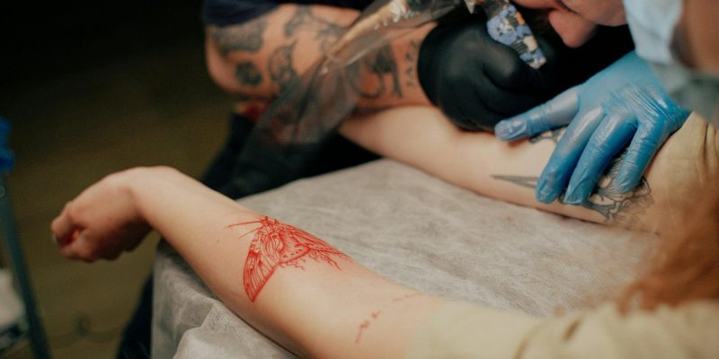
Just recently on TV we had Mark Wahlberg vs Ruby Rose tossing around the pros and cons of tattoos. The biggest con was the permanency of tattoos and the impression it creates for you.
Giving your brand a new identity can have just as serious impact on your brand as a tattoo does on your body.
Some points to consider before you chop and change, or before you get your first!
Prepare and slow down!
You wouldn’t leave a tattoo design to the last minute, would you? Some of the worst outcomes in identity design occur when the client is in a hurry.
At The Golden Goose Design Studio we focus on slowing the briefing process down with as little rushing as possible to ensure that we have been given just the right information about your business and the values your business holds to.
Avoid making rash decisions
With something so permanent, you need to take it seriously. Put the time aside, answer the questions that your identity designer (or tattooist!) asks thoroughly. Far too many business owners fob this off to their personal assistant because they’re too busy to deal with it, sometimes ending up in a) more confusion b) a longer design process c) a design the owner is not happy with.
Don’t mark yourself with a fad
Ninja Turtles were only cool when you were 7! They won’t look great on a 76 year old’s body. While tattoos are more permanent, and brand identities do get an overhaul on occasion; don’t choose your identity based on what is currently fashionable. Trends change – an identity design that stands the test of time is a worthy investment (think Nike swoosh).
View it in place
I’ve heard that if you are considering getting a tattoo, you should first test it in the area you want with henna – size, colour, positioning – before you get the real thing. Seeing your new identity ‘in place’ – on a sample letterhead, business card, signage, web header etc is just as crucial. You might like an identity on a white piece of paper at A4 size, but when it is in place it might not sing to you as much.. or vice versa.
An experienced identity designer should be able to hold your hand during the briefing process so that it is smooth sailing for you as the client.
Questions to ask yourself before signing off on your new identity design:
- What are your brand values?
- What you want your new identity to represent?
- How do you want your brand to be perceived by your target audience?
- Does this put my brand in too small a box?
- Does it limit future service offerings?
Sometimes the most minor of details can have the largest impact.
What logos do you think will stand the test of time?


Love the comparison of tattoo to logo.
Thanks for the tips.